Case Study | The Dirt Concern
Client Name: The Dirt Concern
Project Scope: Logo Design, Visual Identity, Product Design
Key Words: Community Development, Inclusivity, Stewardship, Outreach & Education, Fun
The Dirt Concern, SWMMBA’s Bozeman Chapter, is dedicated to enhancing trail access and advocating for mountain biking in Southwest Montana. Despite their vital role in the trail building community, they lacked a distinct visual identity that would help differentiate them and effectively engage with their audience.
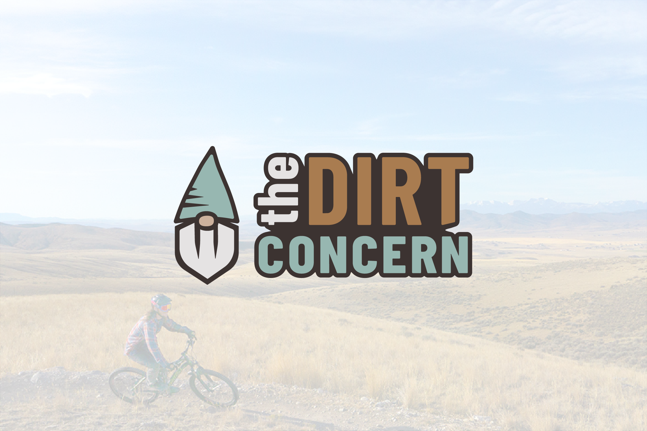
Recognizing the importance of establishing its own identity within the broader trail building industry and Bozeman community, The Dirt Concern sought a unique logo that would capture the essence of its mission and values. They faced the challenge of avoiding clichéd imagery commonly associated with mountain biking logos while staying true to their playful and inclusive nature.

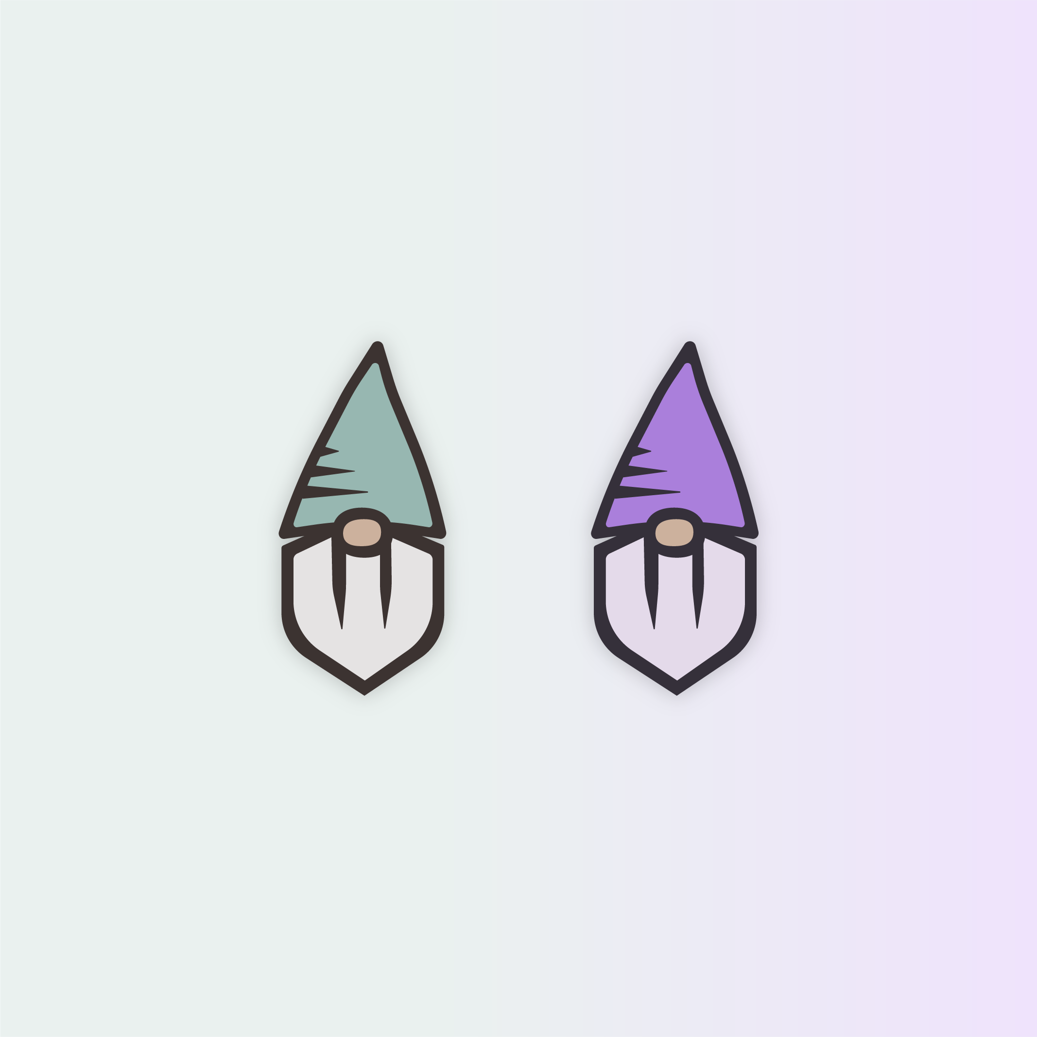
Drawing inspiration from their original gnome illustration, Cirque to Peak crafted a captivating logo featuring a gnome mascot symbolizing stewardship and adventure. The gnome's shovel and mountain-inspired cap, along with bold lines and a dirty teal and brown color scheme, evoke a sense of organic stewardship and connection to the trails while steering clear of clichéd graphics.
The unveiling of The Dirt Concern's new logo sparked stoke and enthusiasm within the community, signaling a refreshed and purpose-driven approach to their mission. The seamless integration of the logo and visual identity into their social media platforms has enhanced their online presence and engagement.
Furthermore, the organization's proactive promotion of a gnome sticker contest with support from local businesses demonstrates its commitment to building community involvement and brand awareness.
The Dirt Concern's refreshed approach reflects its mission-driven focus, empowering them to continue making a positive impact in the trail building community while establishing themselves as a recognizable and respected presence in the Bozeman area.


